Wednesday, September 14, 2011

Fabric "Flower" Lampshade

The fall air is settling in here and I am loving it. I think this weekend will kick off the fall decorating. I am seeing mums, hay bales and pumpkins galore in my future! In the meantime, I have been working on a lot of smaller projects around. It's amazing how the change in weather has sort of kicked me in to gear again.

This project is super simple and everything was free. In fact, I am pretty sure anyone who owns a glue gun can pull this baby off without spending a dime. All you will need is a lamp shade of your choice and some leftover fabric (be creative here, old t-shirts work too!).

To start, I pulled out the leftover fabric from Bray's upholstered headboard and began to cut it into long strips about 2-3 inches wide. I purposefully cut strips that would show both the white and yellow cabana stripes of the fabric. Once Bessie, my trusty glue gun, was warmed and ready I squeezed a small pool of glue in the center of the lampshade. Fold the fabric in half lengthwise and push one end into the pooled glue and hold until secure.

Now, working in a circular fashion, drop a bit of glue and press down your fabric. I twisted and manipulated the fabric so that it wouldn't look perfectly round. I wanted it to look like a flower.


Continue to work your way around until you reach the end of your fabric strip. With the last bit, I tucked it under the round of fabric I laid before it so that the frayed ends wouldn't show.


You can make one large "flower" or multiple smaller ones. Either way I think it would look sweet. This technique can also be used for a toss pillow or even curtains! Could you imagine panels with these cascading down it.....maybe in a nursery? For me, I wanted something for my new desk/crafting area.


Yippee! I love it and it brings in a little yellow (seriously becoming one of my favorite colors around here!)

Friday, September 9, 2011

A Two Parter!

Well I warned you......the crafting world was right! The Martha Stewart Crafts line is pretty dang fantastic! I don't know what I love more: the stencils or the color selection of paints! My favorite is Wet Cement. Such a pretty gray. Anywho, I am diverging from the main point of this post.....our new master bedroom drapes! OK scratch that too.....this is a two parter, peeps!

Uhhhhh the new drapes had to accompany all the other "new" stuff in the room......yes, I, once AGAIN, decided that the bedroom needed tweaking (Part One). To be fair, from the day we moved in I had less than two weeks to unpack before Miles joined the family. In my weakened condition (ie. rotund condition), I simply pointed and furniture was placed in position.

We make some seriously BIG kids!
It wasn't until almost a full year later that I realized the room felt cramped. The Hubs found me standing in the middle of the room staring at the bed one night. The conversation went something like this....

Hubs: "Uh hun.....what's up?"
Me: "Huh? What? Oh sorry. Can we talk?"
Hubs: "Um ya......should I be worried?"

I really am super lucky to have a partner in this life that supports my wackiness. Once I divulged all of my "dislikes" in there, I went on to explain all of the changes I wanted. One of which was taking the bed off of the long wall and moving in front of (EEEEEEEEKKKKKK) the windows!

I don't know how or why, but it has been embedded in my mind that you can't place a bed in front of a window. Maybe subconsciously I think it will block the light.....or I heard somewhere that is was a decor faux pas.....who knows. Do other people think that too? Am I alone? Where did this train of thought come from??

What I do know, is the second that bed was moved, the entire room opened up. It felt MUCH bigger. And both of us loved it!

Now that the windows were such a focal point to the room, I realized we needed them to make more of a statement. In my haste to get something up when the baby came home, I placed the curtain rod directly above the window frame trim. The old drape panels (BOO HISS....GROSS) were 84 inches in length. Add this mistake to the list! At 84 inches, they did not pool on the floor and really shortened the look of the windows.

The old rods were brushed nickel.....again add to the list (this list is growing daily.......gerrrr). I needed more contrast against the color of the walls which is a warm, golden yellow. So the drapes and hardware were removed, the holes patched and painted, the hardware was spray painted black and placed back up. This time though, the hardware was installed just below the ceiling line. By taking the draperies to the ceiling, the entire room felt bigger visually by drawing the eye up wards. LOVE LOVE LOVE.

For the drapes (Part Two), I searched online for something that tickled my fancy and I kept returning to the West Elm drapes. I loved the graphic prints that were done in the softer, muted grays.

To achieve a similar look, I purchased 4 white cotton twin bed flat sheets at $5 a piece. The sheets are the perfect length to achieve a light pooled effect at the floor line (me likey). Martha got in on the action and I used the large trellis print pattern to block print along the edge of the inside hem of each sheet.

Hardware to the ceiling line. Yippee!

See the imperfections?

I wanted these to look home made and a little older. Almost a vintage vibe. So I used the Wet Cement gray with a large spouncer to create areas of more paint and areas of less along the pattern. It created a really great worn look to the print and I love it.


 The room feels bigger and taller. We LOVE color and pattern and there is just enough contrast in the bedding and trunk to make us both happy. All in all, this has made us fall in love with this room again. So the lesson here is not to be afraid to make some changes if something is nagging you!

Currently partyin' at

Chic on a Shoestring Decorating

The Shabby Nest

Wednesday, September 7, 2011

Furkids

I don't always mention my two older children here.....but years before Bray and Miles joined this family, I was already a Mom to two rather adorable, hairy boys: Lucky and Curly. Lucky arrived first by way of a dumpster in Nashville, TN. At 6 weeks old, a police officer working a detail heard his squeals and rescued him from a fate I cannot even think about with out crying. His condition was poor and he was slated for euthanasia (welling up). A wonderful rescue (www.americanlabrescue.com) snagged him from that shelter when they saw how special he was. They healed him physically and began to heal him emotionally when somehow we found each other. To look at him now, one couldn't even tell what he went through in those first weeks of life. The officer who found him wrote the name "Lucky" on his report (which I have a copy of) and I could not bring myself to call him anything but when he finally came home.

Look at that mug!
He was so proud when his new baby brother came home.

Curly found his way to us by way of Baton Rouge, LA. His birth momma was a stray and a day or two after arriving at the shelter there, she gave birth to a little of 11 puppies!!! She was emaciated, but somehow these puppies fought hard and ALL survived. It was about this time, we started talking about adopting again and I sent a feeler email to the rescue about number 2! A half hour later, the woman who had been involved with rescuing Lucky sent me an email with a shot of an adorable puppy. She knew Lucky well and was convinced this puppy would be a perfect fit for all of us. She was so undeniably right. From the moment we set him down on the floor next to Lucky the two have been inseparable.


So while sitting in the yard this past weekend and watching Miles and Bray roll around on the grass with Lucky and Curly, I realized we didn't have a silhouette of the pooches up on the wall! Flash forward to me running around the yard trying to get a "profile" shot of each dog. Most of the shots came out as blurs, but I was able to get a few that showed their body in profile.


The Hubs had made some boards for me out of scrap plywood in our workshop. He just cut them into smaller rectangles and routed the edges. I painted these Dover White (also leftover from our trim) and used the same technique as the child's silhouette. I transferred the outline to the wood board instead of black paper to be cut out. Then I just painted the outline in black paint (and filled it in).


I ended up using an older pic of Lucky seated.
I stenciled in their names using the same transfer technique in Albany font. With a picture frame mount attached to the back, these babies made their way on to the wall! Love!

Labor Day Fun with Martha


What a week! The Hubs took all of last week off for a staycation here at Casa de Farias. We contemplated going away and after much deliberation (ok maybe one glass of wine later), we decided that it would be really nice to stay home and enjoy each other's company in our beautiful home. We explored the apple orchard, took day trips to Portland, Maine and Portsmouth, New Hampshire, ate some seriously good food (lobsters straight from the docks in Portland) and worked on lots of projects that had been on standby this summer!

Bray was convinced these were "bugs".


During one of our day trips, I ran in to Michael's (we do not have one near our house.....BOOOO) and took a quick peek at the Martha Stewart stencil and craft paint line that everyone has been raving about. Well let me join in on the raving.......LOVE THEM! I had a 40% coupon to boot so for under $20, I left with lots of paint and the stencil set I wanted. So get ready for LOTS o'projects with these babies!

The first one is so simple, but really turned out so sweet! And fitting, as we spent our entire 10 day vacay at home. Using the larger lattice stencil, I used some yellow craft paint to stencil a strip across a piece of card stock. Once dry, I created a little quote in paint using a clip art outline of a home. I printed the "home sweet home" quote onto the stenciled card stock and put it in an over sized frame. I love the way it turned out.


Wednesday, August 24, 2011

Updating a Piece...Again!

Ever get that nagging feeling when a piece of furniture is just not working for you? Maybe it's the spot it's in, or the color of it, or the hardware.....but something is just. not. right. I have been having this sort of love/hate affair with the highboy dresser turned bar console in our dining room. Let me take you on a brief tour down memory lane........

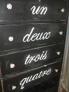
A friend of mine found this cute little dresser on craigslist and immediately sent me the listing. It was love at first sight and after looking it over I knew it would be turned into a bar. After loading it up with stemless glasses and wine paraphernalia, I was even more in love with it....until......the corner it was sitting in didn't feel like it was noticeable. I had worked hard on it and I wanted to have it stand out more. I didn't want people to look and think...."Gah......why is there a dresser in here". After facing a disaster with yellow paint (don't ask), I realized that by stenciling some numbers along the drawers, the piece had a lot more personality.


This brings me to the present day, when for over a week I kept rambling on about how it wasn't quite right. I saw some pieces that used the same idea but with the numbers as words. I particularly liked the scrolling script on this piece by Molly Susan Strong!

Call it one too many viewings of Ratatouille with the boys, but I found a way for me to be happy again when I glance over at that lil' dresser!


Notice the missing wine bottles underneath....Mama needs to stock back up!
I used the same technique from creating wall quotes and rubbed over the lettering with a fine grit sandpaper after it dried. It looks slightly aged and stands out in the corner. Exactly what I was looking for!

How to Create a Terrarium


I think the title of this post makes it sound a lot more complicated than it actually is. Truthfully it sort of hit me when I was out a few days ago and saw a terrarium at a store. I L.O.V.E. the look of them and always find myself drifting over to them at shops, but more often than not, I usually am back stepping once I can read the price tag. This is typically followed by me muttering something like....."It better be able to cook me dinner and do the laundry for that price." Finally I had a light bulb moment and realized that DUH! I could DIY one!

The best part is that you may already have all of the "parts" to do this project.

You will need:

a glass hurricane (something with some height)
a plant saucer
a small potted plant (I particularly love when herbs are used!)

After scurrying around our storage for a bit, I found the glass hurricane I had in mind. At that point, I just snuck out to my garden, grabbed a saucer and some lemon oregano and put it all together!

I added a little wrought iron bird on top (like a lil' finial) to finish it off!


Monday, August 8, 2011

Kid's Upholstered Headboard

I am still in amazement daily at how much our babies are becoming boys. Bray wants to do everything himself now ("no thank" might be the most popular word phrase EVER). And sweet Miles is a hop,skip and a jump away from walking. Everyday I feel the internal struggle that I am sure every parent feels. You want them to walk, talk, dress them selves, etc etc etc and then the minute they do, you find yourself back treading because they are growing WAY. TOO. FAST.

At 18 mos when Bray vaulted out of his crib sans Nadia Comanici, I had a brief moment of "Please not yet" at the thought of him in a "big boy bed". That was the first of many first's that brought us all the way to bringing in the for real's big boy bed! Yes, we finally caved and gave the kid a twin bed. It was the only option to accommodate his face down, star fish, take no prisoners sleeping style. For now, he still has his "Lovie" and of course his favorite fleece blanket, but for the most part he is officially sleeping in a real bed (no side rail either....insert sad face.)

This development has obvious perks. No lugging two pack and plays anywhere, not having to worry about where to put him to sleep if we crash at the in laws etc. It also has created an issue on security. Bray is a ninja at escaping a room or even a house. Just this morning, he bypassed a door and two baby gates and went downstairs to get himself some milk. Upon realizing he couldn't get the leverage he needed to pull the milk from the fridge, he came back up stairs to get me to "Haaaaaaaaaaahhhhh.....lp" him. We have had to install multiple obstacles to keep him safe and that has created a whole new neuroses at bed time. Imagine me sitting there running the check list with the Hubs......

"Is the basement door locked?"
"Garage doors down?"
"Security knob on the basement stairwell door in place?"
"Slider locked and baby lock added?"
"Front door and screen locked?"
"Baby gates locked?"

And on and on.

At the end of the day, these are all inevitable facts as they two lil' meatballs grow up. So after that rant, here are the shots of an easy upholstered head board!

I got the idea when I was cleaning out our linen closet and happened upon a day bed cover from Pottery Barn. Yes, it was a wedding gift. No, we don't even own a day bed. Why did I put this on our registry? I plead the fifth. Knowing that I would never implement this cover as it was intended, I decided to start looking at other uses (pillows, curtains, even a chair cover). Then I remembered how much Bray needed a headboard and my decision was solidified.

I measured the dimensions of the twin bed frame we had and cut a piece of low grade plywood in the same width (the height here is totally up to you!). Once I had the size I wanted, I went to our local fabrics store and had them cut a piece of extra thick foam to match.

In order to create a little extra fluff, I also purchased some batting. I unrolled my batting and then placed my foam down, followed by the piece of plywood.


Enter, my handy dandy Powershot. Working from the middle out, I stapled the batting to the back of the plywood. I think it's easiest to start this way so that the extra batting and fabric gathers in the corners, creating a smooth piece of fabric.


The frame was a perfect fit along the width to a fitted twin sheet. The day bed cover had piping so I incorporated it's piping and seam to the headboard for ease.


After the fabric is lined up, I just followed the back side with staples again. A quick hit with the iron to get rid of the wrinkles and I was ready to head up to his room.


I attached it to the bed frame by just using two pieces of scrap wood to create legs. I then used two anchor screws per leg to attach it to the exterior of the bed frame.


At some point I will get crazy with the bedding, but for now we have a happy two year old! He has all he needs: space to spread out, books at arm's reach and storage for his matchbox!


Related Posts Plugin for WordPress, Blogger...